Netflix – Share With Friends
Role
Product Designer
Timeline
June 2026
Project Type
Feature Concept (UX & UI)
Tools Used
Figma · Prototyping · UX Writing
The Idea
Netflix is built for solo discovery — binge, skip, repeat. But what if you want to share a show with a friend?
There’s no native way to do that.
No friends. No inbox. No personal recommendations.
I designed a minimal system that lets users add friends and send them direct recommendations, without making Netflix a social network.
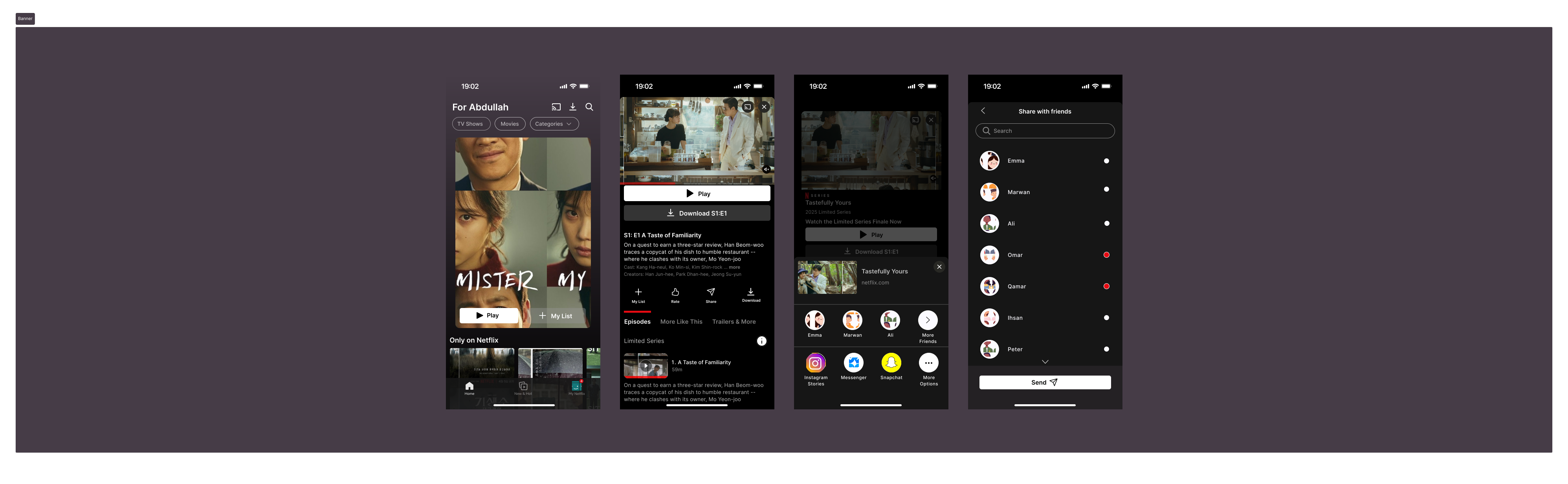
Prototype Preview


The Problem
Netflix doesn’t support intentional sharing.
Sure, you can copy a link. Maybe text it. Maybe they’ll click it. Maybe not.
But there’s no sense of connection. No signal that “this is for you.”
“I just wanted to know if you watched what I recommended…”
– Every user who’s ever sent a Netflix link.
Sharing a link over text usually starts a whole conversation.
But sometimes, you just want to recommend something without opening a random chat.
Understanding our User
To validate the idea, I interviewed 3 of my brothers and 3 close friends who use Netflix frequently. All of them agreed that while discussing shows in person is fun, the titles are often forgotten once the conversation ends.
When it comes to texting a show link, they felt it creates unwanted pressure — like a silent obligation to watch. Instead of pulling them in, it often pushes them away.
When I proposed a native way to share content directly on Netflix, the feedback was positive. Most loved the idea, but a few raised concerns:
- It must remain simple and intuitive — complexity would kill the habit.
- It shouldn’t become a social app — no feeds, no DMs, no status updates.
These concerns helped shape the minimalist, content-first approach of this concept.
Opportunity
Instead of turning Netflix into a full-blown social app, I explored:
- A minimal “Friends” layer (no chat, no posts).
- A recommendation system embedded within current UX.
- Simple UI logic: Find a show → tap Share → pick a friend → done.
This keeps the product focused on content, not conversation.
System Components
1. Friends List (Spotify-style)
- Avatar and name.
- No chatting, just a lightweight presence.
- Only reason this exists: so you can send content to people.
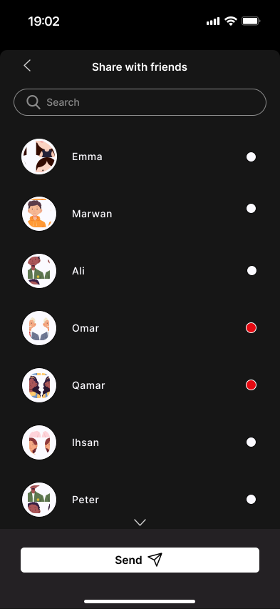
2. Share With Friends
- Share button on every episode or title.
- “Share with friends” screen that extends the existing share dialog upwards.
- Search bar + profile pictures to simplify selection.
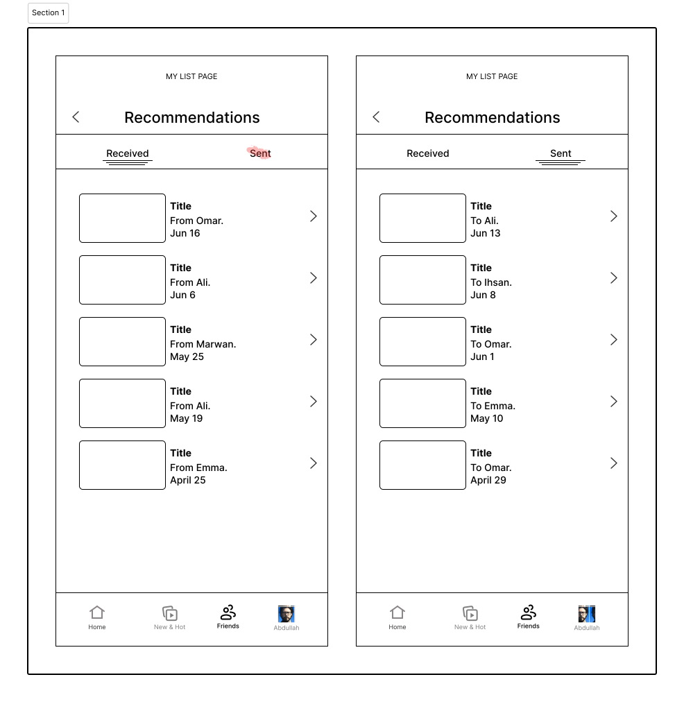
3. Recommendations Inbox
- New “Recommendations” tab under the profile.
- Two tabs:
ReceivedandSent. - Each item shows the show title, sender/recipient name, and date.
- Tapping takes you directly to the title.
User Flows
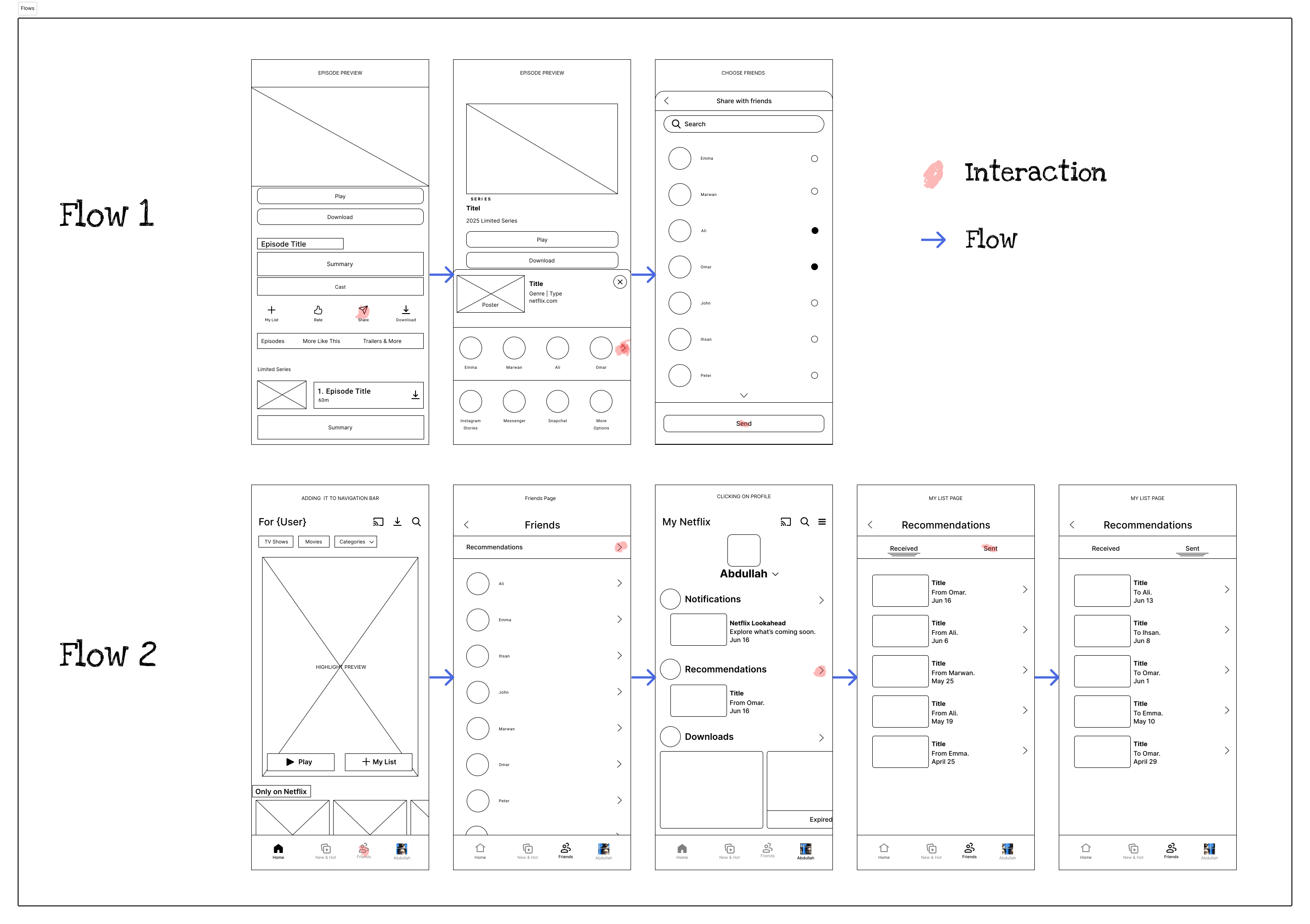
Flow 1: Share a Show
Home → Episode → Share → Select Friend → Confirm
- Most natural path for recommending something you’re watching.
- Uses the existing sharing system, but frequent friends to the list of socials.
- “Share with friends” extended menu shows up after clicking on “More Friends” button”.
- Recommendation is logged and sent immediately.
-> This flow makes sharing shows as easy as adding them to your list.
Flow 2: View Your Network
Home → My Netflix → Recommendations → Friends list
- Recommendations appear under Notifications in
My Netflix. - Access to full list of sent/received recommendations.
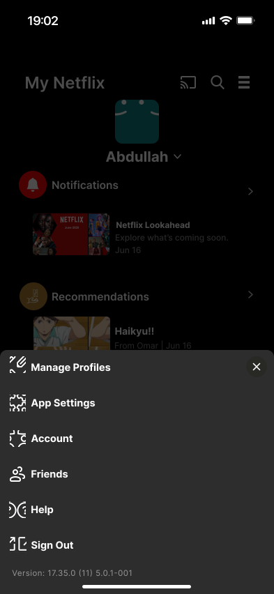
- Friend list is accessible via hamburger menu.
Using the approach:
-> You have a few friends, but it’s not the main product.
Deciding an entry point
I thought having the Friends Page button in the navigation bar, but that made it feel like a social network app.


Design Principles
1. Keep It Personal, Not Social
There’s no feed. No stories. No pressure to respond.
This feature is about intentional recommendations, not content broadcasting.
2. Invisible Until Needed
The “Friends” and “Recommendations” sections don’t overwhelm the experience.
They’re tucked into profile or hamburger menu, only appearing when relevant.
3. Native Language
Used Netflix’s voice in all copy:
- “From Omar” not “Recommended by…”.
- “1 Recommendation” badge in red.
- “Chevron” button that takes you directly next to suggested title.
Why It Matters
- Helps users feel connected without disrupting the content-first model.
- Encourages organic discovery among friends.
- Uses familiar patterns without overbuilding.
MVP Scope
| Feature | Value | Status |
|---|---|---|
| ✅ Recommendations Tab | Track sent/received | ✅ Included |
| ✅ Friends List | Lightweight social | ✅ Included |
| 🟡 Notifications badge | Awareness/engagement | Could add |
| ❌ Chat or Replies | Out of scope | ❌ Skipped |
| ❌ Public activity | Social creep | ❌ Skipped |
Final Thoughts
This feature wasn’t about making Netflix social.
It was about making sharing simpler, personal, and non-intrusive.
I treated the “Friends” list as a means to an end.
The real goal? Letting people say:
“Hey, I thought of you when I saw this.”
That’s what recommendation should feel like.
Not marketing.
Just a moment between friends.